Visual Identity and Branding
Skills: competitive anaylsis, sketching, ideation & iteration
Tools: Adobe Illustrator, Adobe Indesign, Adobe Photoshop
Tools: Adobe Illustrator, Adobe Indesign, Adobe Photoshop
El Harissa Rebrand
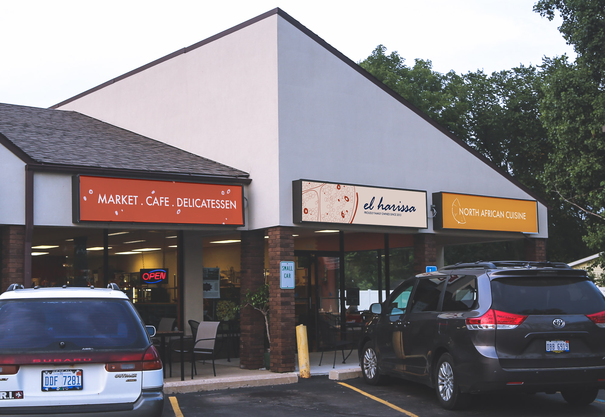
Located in Northwest Ann Arbor, El Harissa is a family-owned restaurant inspired by traditional North African and Mediterranean cuisine. The proprosed brand identity seeks to do more than simply define El Harissa as a North African restaurant. It strives to communicate the homey and welcoming atmosphere that customers love.
︎︎︎ Full brand guide
![]()
![]()
El Harissa Rebrand: Process

Overview
When El Harissa opened in 2013, founders Susan and Khaled Huaomed were both first time business owners. The restaurant has continued to evolve over the years, but their values have remained consistent — communication, education, and sustainability. In addition to offering meals, coffee, and gelato, El Harissa also has a small boutique market, which opened following the onset of the Covid-19 pandemic. For this project I was tasked with proposing a complete design overhaul of the restaurant’s visual identity and branding system.
When El Harissa opened in 2013, founders Susan and Khaled Huaomed were both first time business owners. The restaurant has continued to evolve over the years, but their values have remained consistent — communication, education, and sustainability. In addition to offering meals, coffee, and gelato, El Harissa also has a small boutique market, which opened following the onset of the Covid-19 pandemic. For this project I was tasked with proposing a complete design overhaul of the restaurant’s visual identity and branding system.
As a result of growing with its founders, El Harissa lacks a coherent visual identity. The restaurant currently uses multiple different logos. Other elements, such as outdoor signage, were picked when the restaurant opened in 2013 and no longer represent the company’s image. Furthermore, both food and market items are labelled with small cards hand-drawn by employees. Whilst well-loved, the practice is not sustainable as the range of products continues to expand.


Design Goals
El Harissa’s visual identity should do more than simply define it as a North African restaurant. Whilst first and foremost seeking to communicate the “colourful, youthful, and joyous” character of the region, this redesign seeks to establish imagery of North Africa in the popular conciousness without falling into tropes. Moreover, it strives to embody the homey and welcoming atmosphere that customers love about El Harissa, whilst remaining flexible to account for the restaurant’s diverse consumer base and the varied ways they interact with the establishment.
El Harissa’s visual identity should do more than simply define it as a North African restaurant. Whilst first and foremost seeking to communicate the “colourful, youthful, and joyous” character of the region, this redesign seeks to establish imagery of North Africa in the popular conciousness without falling into tropes. Moreover, it strives to embody the homey and welcoming atmosphere that customers love about El Harissa, whilst remaining flexible to account for the restaurant’s diverse consumer base and the varied ways they interact with the establishment.
Inspiration
My design process began with extensive research into the visual culture of North Africa. I collected images ranging from natural geographical formations and food, to the works of designers and brands from the region. In addition, I performed a detailed competitive analysis, investigating North African cuisine in the southeast of Michigan. This allowed me to better understand how similar restaurants — such as Jerusalem Garden, Saffron De Twah, and The Blue Nile — established coherent brand identities through logotypes, menus, and online presence. Finally, I investigated the way various brands, including Trader Joe’s, incorporate sustainability into their visual identity. My findings revealed that earth tones, handcrafted elements, and reusable materials (such as cardboard, cotton, and recycled paper) serve as important visual cues. By emulating the hues of traditional North African pottery, I was able to create a colour scheme that feels naturalistic, grounded, and representative of the region.
My design process began with extensive research into the visual culture of North Africa. I collected images ranging from natural geographical formations and food, to the works of designers and brands from the region. In addition, I performed a detailed competitive analysis, investigating North African cuisine in the southeast of Michigan. This allowed me to better understand how similar restaurants — such as Jerusalem Garden, Saffron De Twah, and The Blue Nile — established coherent brand identities through logotypes, menus, and online presence. Finally, I investigated the way various brands, including Trader Joe’s, incorporate sustainability into their visual identity. My findings revealed that earth tones, handcrafted elements, and reusable materials (such as cardboard, cotton, and recycled paper) serve as important visual cues. By emulating the hues of traditional North African pottery, I was able to create a colour scheme that feels naturalistic, grounded, and representative of the region.


Logotype
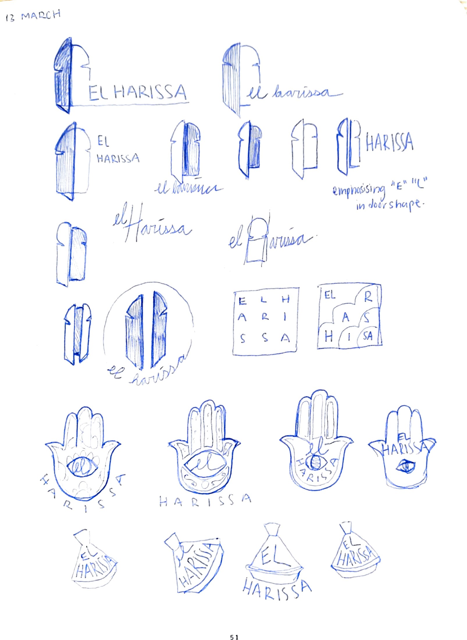
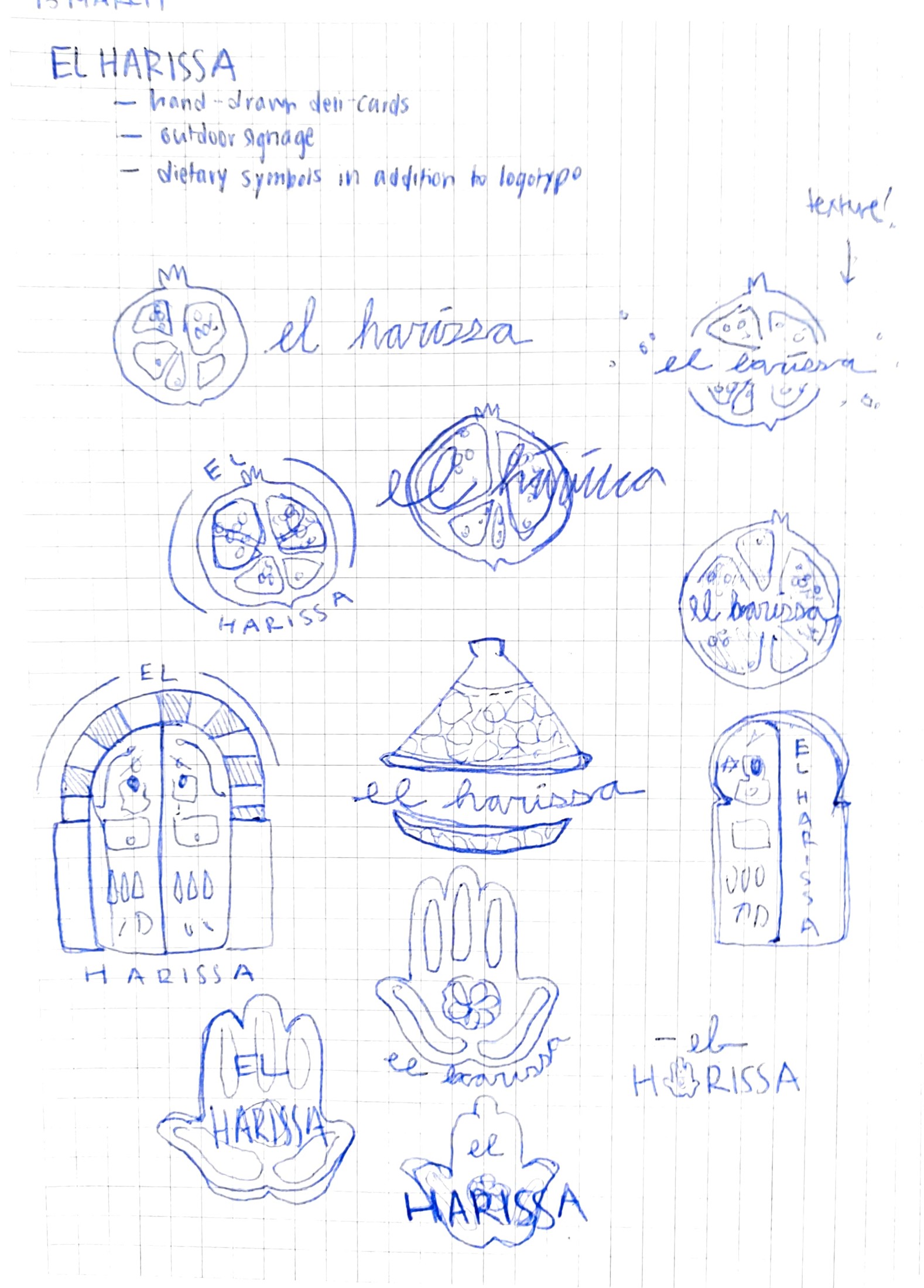
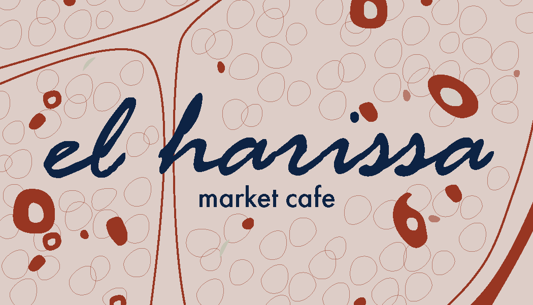
The design process began on paper. Starting with the Tunesien door, I explored a variety of of symbols that had appeared in my research of North African visual culture. I decided to move forward with a pomegranate as the main logomark for El Harissa, using elements from my original sketch to preserve the illustrative and textured quality. This was paired with a script font, chosen to ensure the logotype maintained a handcrafted and welcoming feel.
The design process began on paper. Starting with the Tunesien door, I explored a variety of of symbols that had appeared in my research of North African visual culture. I decided to move forward with a pomegranate as the main logomark for El Harissa, using elements from my original sketch to preserve the illustrative and textured quality. This was paired with a script font, chosen to ensure the logotype maintained a handcrafted and welcoming feel.
Brand Application
Rage Italic, used exclusively for the logotype and large headings in print, is paired with clean and readable Futura PT in both Light and Demi weights. These are used for body text and headings/sub-headings respectively.
Rage Italic, used exclusively for the logotype and large headings in print, is paired with clean and readable Futura PT in both Light and Demi weights. These are used for body text and headings/sub-headings respectively.


